
Packaging
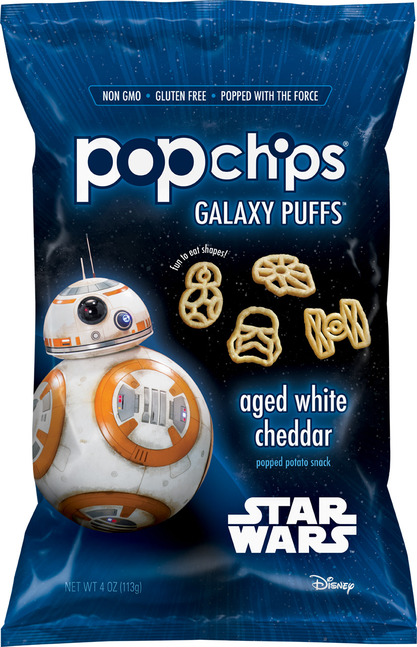
popchips partnered with Star Wars for the first time in 2015 but decided to take it to the next level for their second go-round in 2017. We created a whole new product, Galaxy Puffs—puffs in the shapes of much-loved characters and ships—and its launch coincided with the release of “Star Wars: The Last Jedi.” We designed the packaging to be a mix of both brands: popchips and Star Wars. Achieving the balance between the brands was educational in its challenges. Despite the mega-entity that Disney is, this product was to be popchips'—with a Star Wars spin. The final design leads with popchips as the first read, and the iconic imagery of Star Wars characters is a close second. Third-most important was showcasing the unique snack shape with photorealistic illustrations. The design team lead the process of creating the puffs imagery with an outside creative, which yielded illustrations that were perfectly imperfect. And to finish it all off, I attended the press checks for this item, seeing the printing process all the way to the very end.
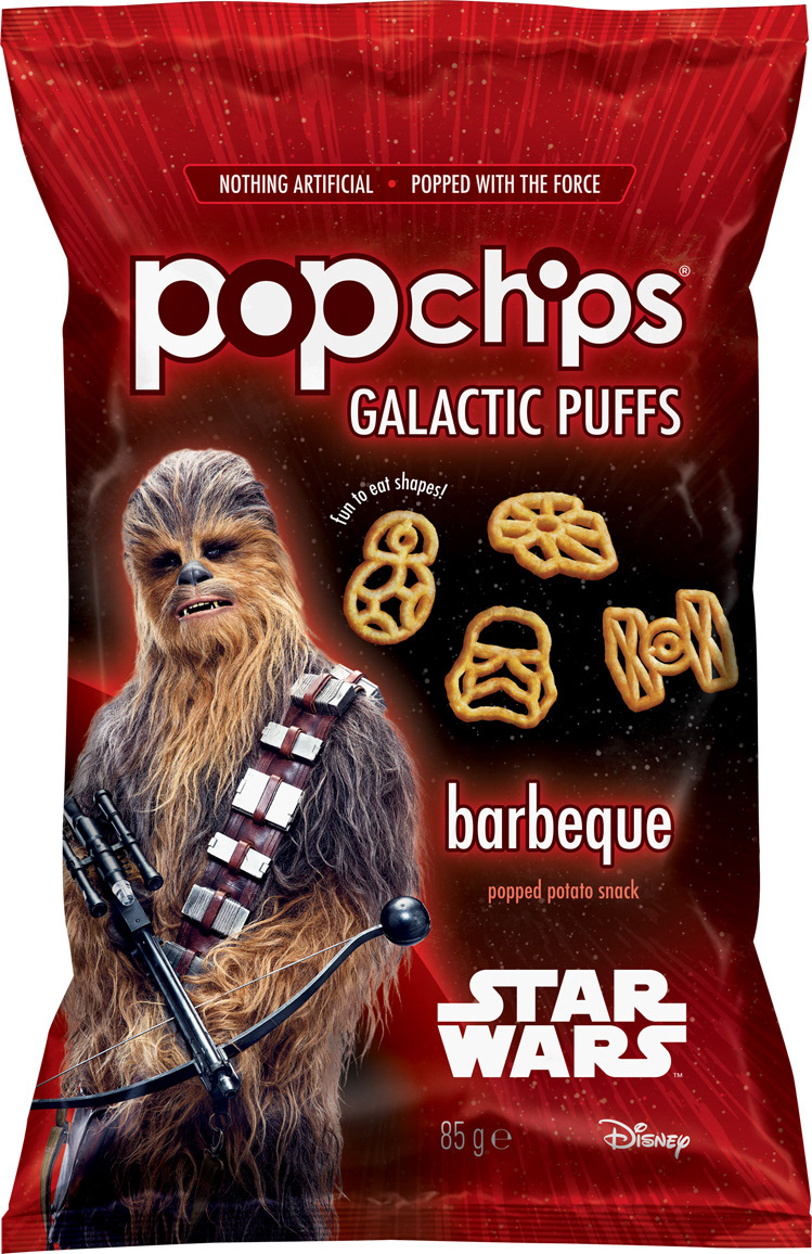
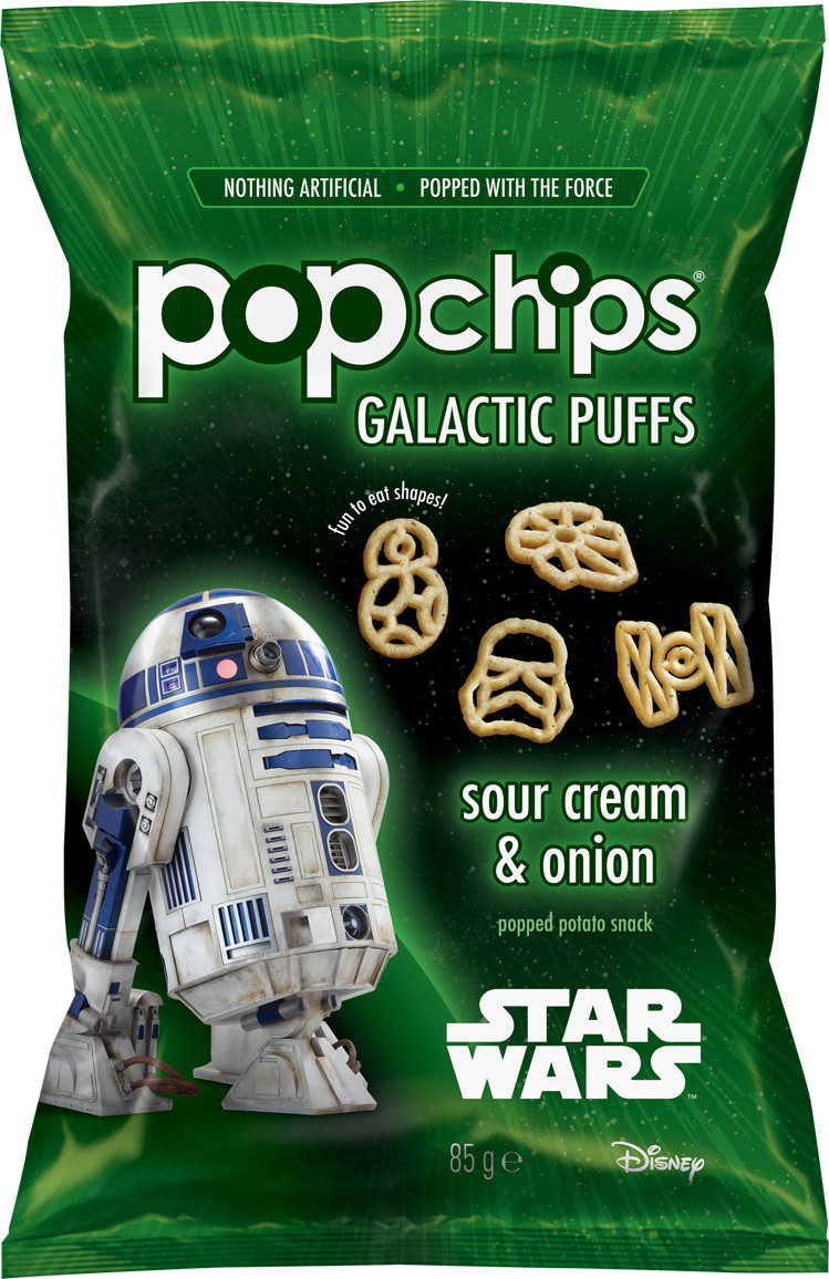
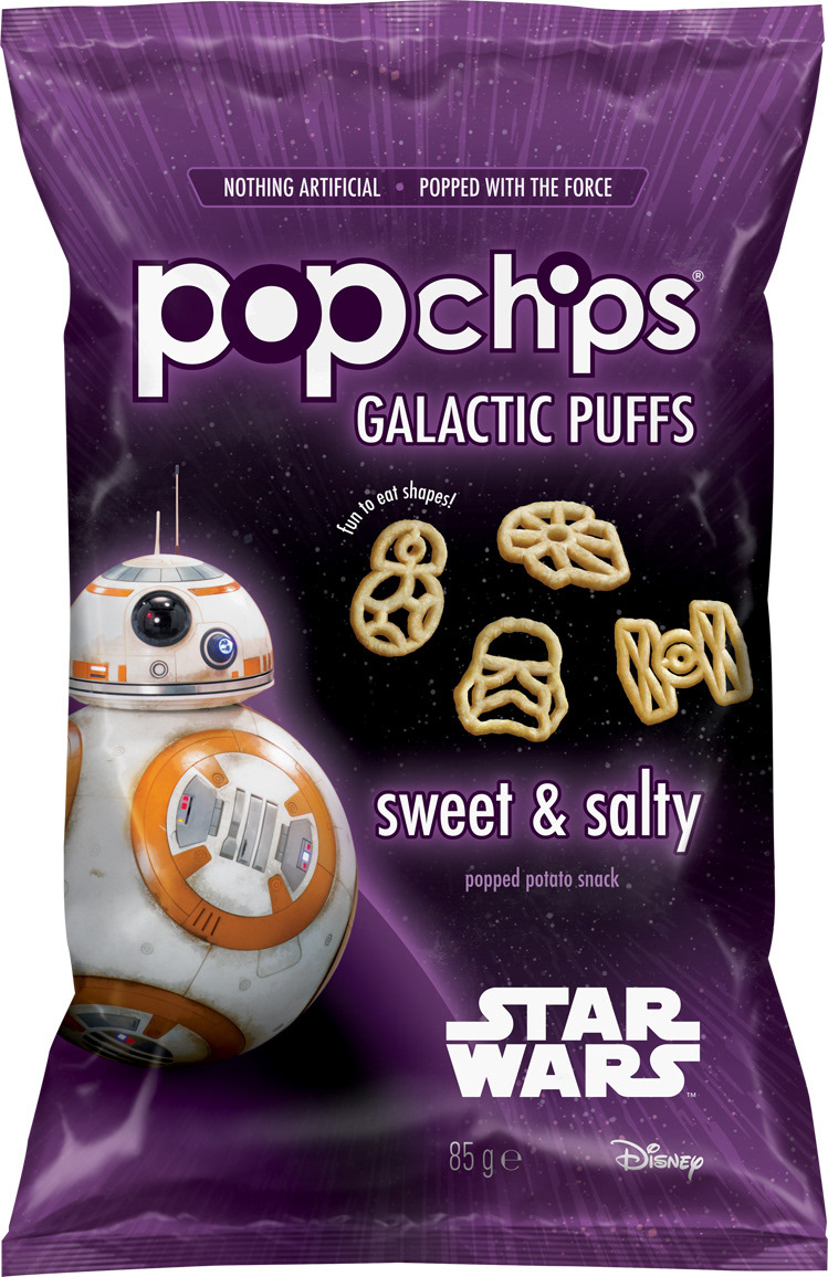
(If you noticed some differences between the blue bag and the red, green, and purple bags, here’s why: popchips produced the Galaxy Puffs [only one flavor, Aged White Cheddar] for the US market, and the Galactic Puffs [Barbeque, Sour Cream & Onion, Sweet & Salty] for the UK market.)
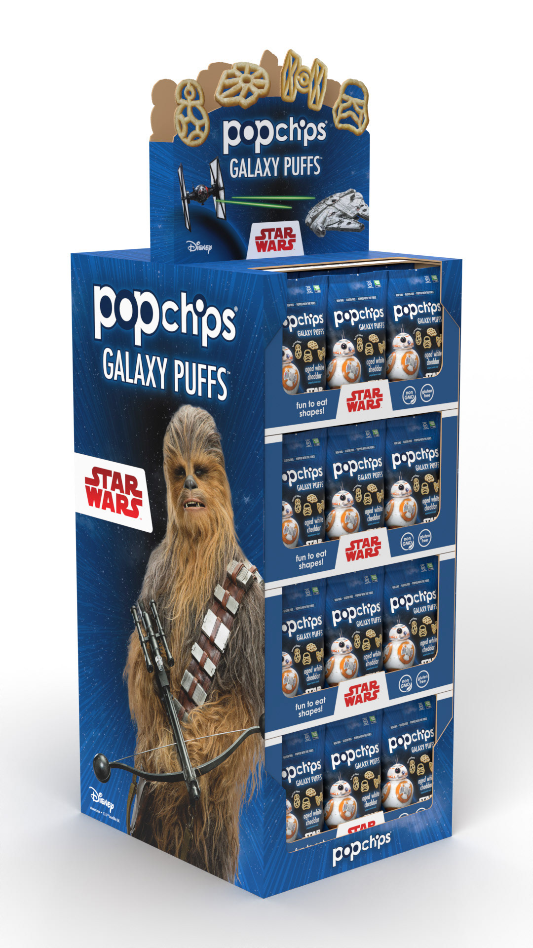
Point-of-Sale Display
Grocery store displays were designed sparse to feature large-scale character imagery in order to cut through the clutter, and custom die-cutting and foil highlighted the unique product.