Packaging
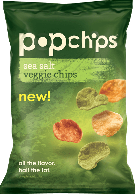
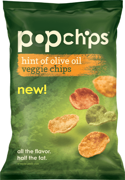
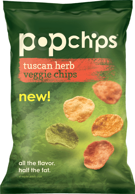
popchips launched their veggie chips in 2014 while the main popchips line was still in its original packaging. The veggie chips' design needed to fit in, yet differentiate in all the right ways. Certain elements stayed locked in the same position—the logo and the chips—as to not look chaotic on shelf. Giving all the other elements a rustic/farm-treatment, allowed us to “say” things—better-for-you, wholesome, nutritious—without cluttering the bag with additional words. For the paint strokes, I chose spot inks because they could achieve a certain brightness outside the gamut of what CMYK can do, bringing attention to the otherwise conservatively-sized flavor label.
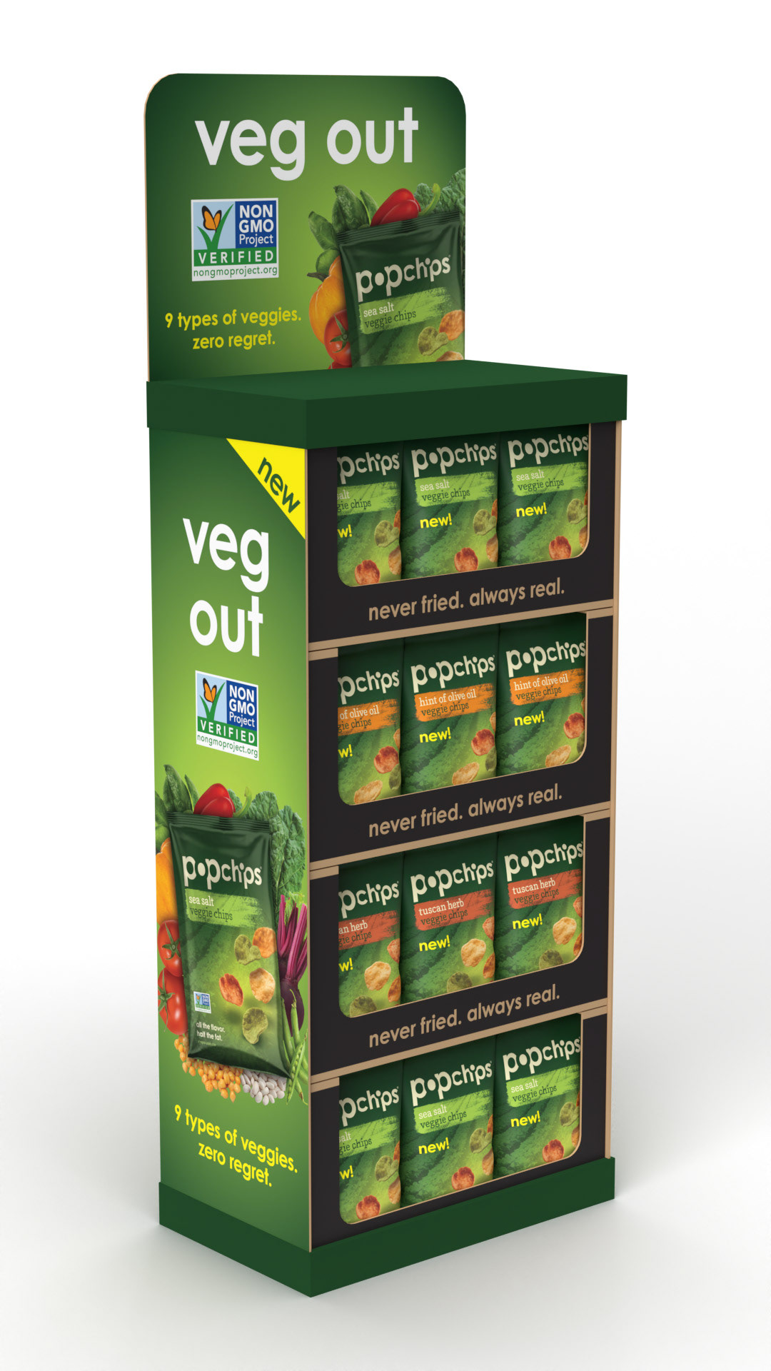
Point-of-Sale Display
For grocery store displays, there was no need to re-communicate the brand or the product—the logo and the bag format would take care of that. We decided to lean into the things we could not fit on pack; we showed off the vegetable ingredients in large, photographic sprays.
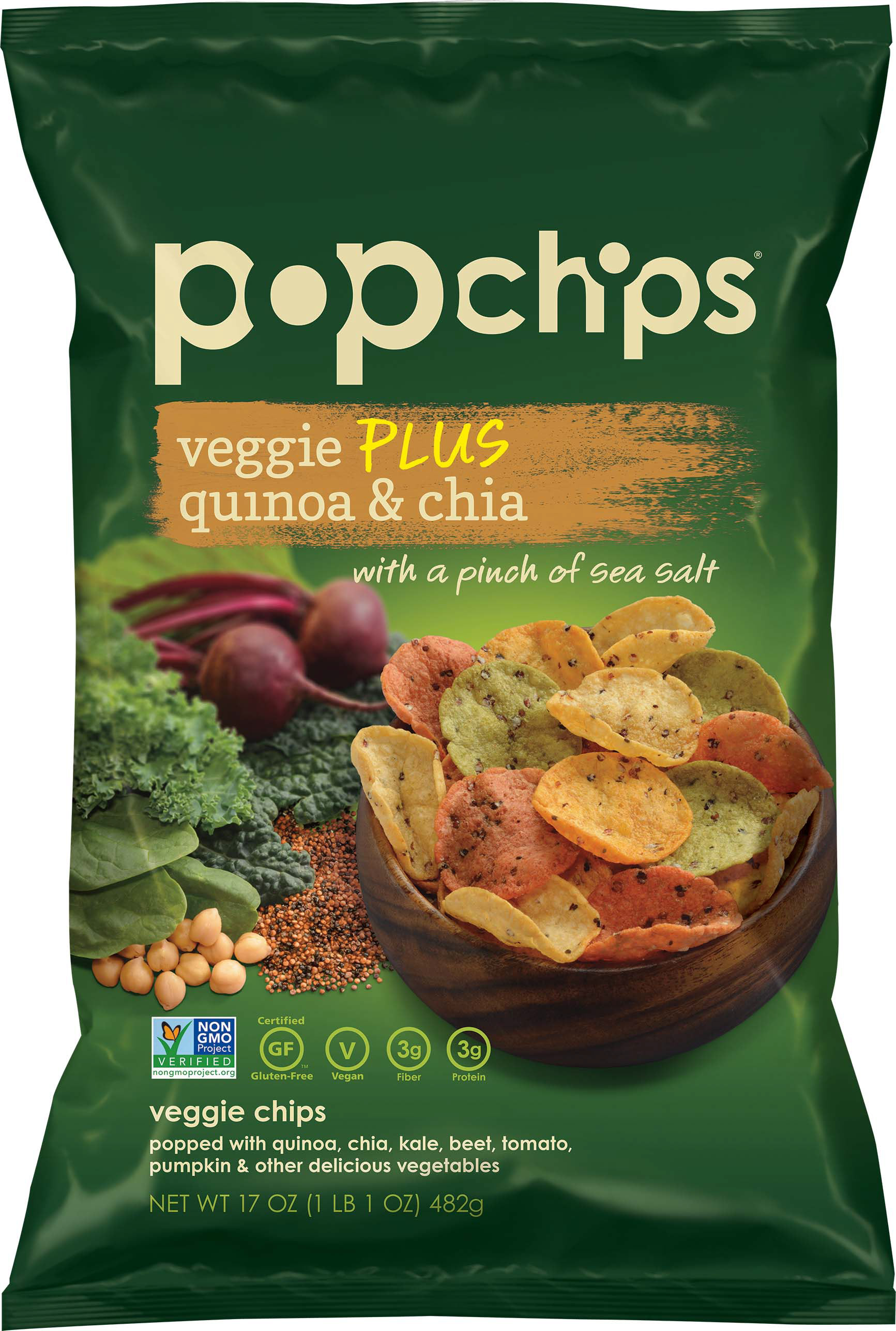
Even More Packaging
Some extra ingredients were added to popchips' veggie chips for a special flavor for club stores. We shot new photography and paired it with the already established color scheme.