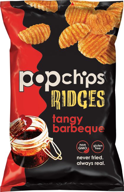
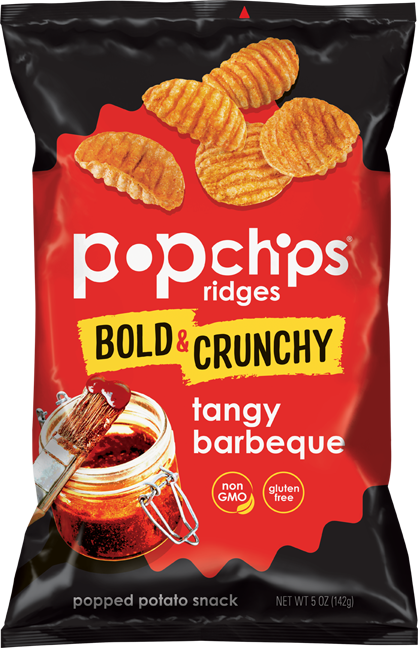
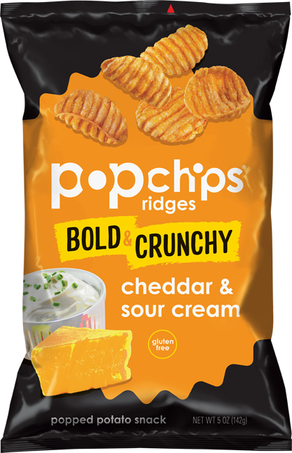
popchips launched their Ridges product in 2016 to appeal to snackers seeking a ‘bolder’ experience. In 2018 we gave it a new look to better communicate the product attributes. We added a very prominent “Bold & Crunchy” banner that reads second after the brand name. And in the background, we swapped the ratio of black and color, so that the color is more dominant to suggest more flavor. The product photography and flavor cues weren’t materially changed in order to maintain continuity with the rest of the brand portfolio; we only shifted them more towards the center to optimize visibility.
Edits made strategically with restraint improved—without overriding the already-existing—consumer perceptions.
After
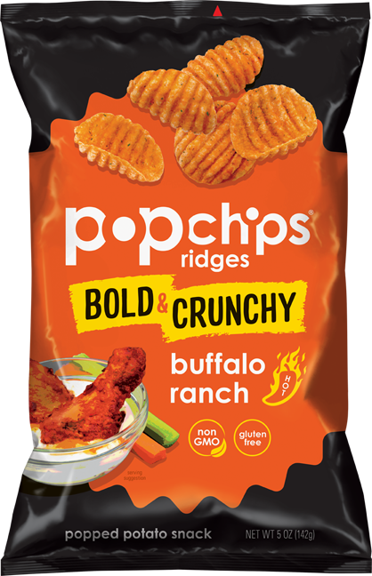
Before